Capturing Muskau Park’s Magic: A Study in Color and Contrast
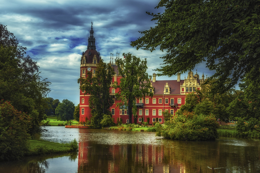
Some images catch your eye; others hold it. This one does both. Here in Muskau Park, the photographer has embraced a warm, carefully chosen palette that draws you in instantly. The castle’s deep, velvety red radiates a sense of history and elegance, becoming the visual heartbeat of the frame. Against it, the rest of the scene speaks in softer tones—muted blues of the cloud-streaked sky, the milk-white touches of light on the clouds, and the quiet greens of the trees and grass. The result is not just a photograph, but a deliberate interplay of warmth and coolness, where one color leads and the others support, giving the image a layered emotional depth.
Table of Contents
The Intriguing Composition
Muskau Park, a UNESCO World Heritage Site straddling Germany and Poland, is a masterwork of landscaped beauty. In this frame, the castle’s clock-topped tower rises elegantly, perfectly positioned between the leafy silhouettes of the trees. The still water in the foreground offers a mirror image, doubling the impact of the bold color choice. The eye moves naturally from the reflection to the building’s ornate rooftop, and then outwards to the softer greens and open skies—an intentional journey shaped by the photographer’s framing.
Mastering Contrast
The choice of a crimson façade isn’t accidental. It’s a powerful design decision—one that takes advantage of color psychology. Red conveys warmth, vitality, and strength; set against the overcast blues of the sky, it gains extra vibrancy. The greens of the surrounding foliage act like a neutral stage curtain, neither competing with the red nor blending into it. This balance allows the warm hue to command attention without overwhelming the viewer, producing an effect that feels almost painterly in its harmony.
Tips for Capturing Contrast
- Pick a Color Hero: Let one bold hue be the star, and build the rest of the scene to support it.
- Pair with Opposites: Warm colors pop best against cool backgrounds, and vice versa.
- Layer with Nature: Use trees, water, and sky to create a gradient of tones that lead the eye.
- Wait for the Light: Cloud cover can mute secondary colors, letting your main hue shine even brighter.
Using Color Palettes Effectively
The artistry here lies in restraint. The photographer hasn’t tried to saturate every element—only the castle wears its color boldly. Everything else plays a supporting role: the greens remain natural, the sky keeps to its subdued blue-gray, and the clouds drift in soft, luminous whites. This selective boldness means the image feels both dynamic and serene, a rare combination that makes it memorable.
Creating Your Palette
- Lead with Emotion: Choose your dominant color based on the feeling you want to evoke.
- Keep a Limited Cast: Two to three main tones are enough; any more and the scene risks losing focus.
- Use Post-Processing with Care: Small adjustments can heighten impact without tipping into the unnatural.
What You Can Learn
Great travel photography blends technical skill with storytelling. Here, color becomes the narrative thread—the warmth of the castle suggesting welcome and vitality, the coolness of the surrounding elements suggesting peace and stillness. Together, they create a conversation within the image, one that draws the viewer in and keeps them looking.
Practical Takeaways:
- Scout for Natural Color Contrasts: Look for places where one tone stands apart from its environment.
- Let the Setting Guide You: The best palettes often come directly from the location itself.
- Balance Bold and Subtle: Make sure your supporting colors don’t fight your dominant one.
- Think Like a Painter: Consider how you might arrange and balance tones if you were creating this scene on canvas.

The crimson castle of Muskau Park glows against a subdued backdrop of blue skies, white clouds, and soft green parkland, its reflection rippling gently across the lake. Link to original. Licensed under CC BY-ND.